What we see and what we know
As a writer on design and exhibition organiser, I am often old-fashioned, having my nose stuck in books (and magazines). I browse and start my inventory for a topic, and this was the same for my explorations of the question of how “to write something sensible about the Essenza”. Of course, I knew Willem van Ast’s design from 1999. However, a rediscovery was launched early last year, when it became known that Apple wanted to make large-scale use of the table in the restaurant of the new head office.

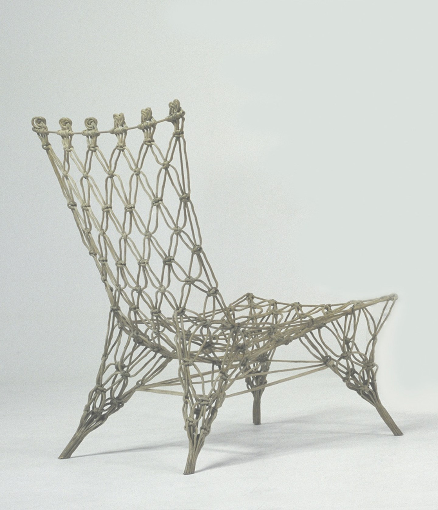
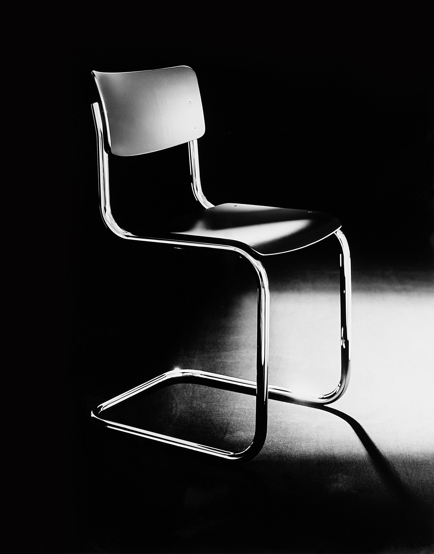
Tables do not generally receive so much attention. In fact, it is striking how a survey of books on furniture and the history of design reveals that chairs are usually the eye-catching and unique items. We also see this cultural bias reflected in museum design collections and (related) prices for vintage furniture. Lovers of modern design have little trouble linking iconic models to the names of designers*: Cantilever, Zigzag, Panton, Eames shell, Knotted, Ant. Such a quiz would not at all neglect tables. For connaisseurs, “the one with that marble top on a tulip foot”** springs to mind. Now that modern design, beginning with De Stijl and Bauhaus, is already a century old, it is time to write a small footnote in the history of the table.


The Essenza easily finds its own place. It does not really matter if the table is in a dining room, kitchen or office. The pure image remains intact even when table rows are set close together, as they are in the huge restaurant at the Apple headquarters in Cupertino. When he designed the table in 1999, Willem van Ast was looking for a pure, almost architectural expression. Robust square legs on the corners bear the solid volume of the table surface. This dimensioning and the choice of wood means that the table is more than a designer exercise in minimalism. Within the Arco product range, it is also almost possible to speak of a small genre of “elementary tables”. It has resulted in a development with almost graphic lines modelled on the Essenza: the Slim Table by Bertjan Pot. Both examples make reference to the archetype of the large, massive table interwoven in the history of Western culture and modern design.
And then there is the legacy of straight lines. At the beginning of the twentieth century, various “grandfathers of Dutch design” were looking for a visual language that fitted with modern times. H.P. Berlage was initially extremely preoccupied with “Egyptian models”, producing a series of chairs on which he projected a modular system of triangles. When they remained nevertheless too ponderous and stately, Berlage chose the non-decorated work chair to give direction to a new design. The most elementary result, the “Berlage stool”, was not designed by the master himself, but reflects the angularity of the architecture of the Gemeentemuseum in The Hague. Moreover, Gerrit T. Rietveld, the other grandfather of Dutch Design, experimented with everything: seating furniture and architecture. Tables? Well no... but the closest thing is the H-bar entrance for the Weaving Mill de Ploeg in Bergeijk from 1960. Although these examples do not directly help build a canon for the modern table, they are indispensable for the development of Modernism. With the Gemeentemuseum as a highlight, Berlage developed an honest visual language of clean geometric surfaces and volumes, in which support and bearing structure determine the expressiveness of architecture. Rietveld (son of a carpenter who became an architect) found the crux of his elementary approach in a woodcut of a port. The posts and beams of a sea wall protrude into space. This spatial description can be recognised in the palisade under the Red-Blue armchair, the Military chair and De Ploeg’s basic visual language.

Good examples are crucial to help the progress of people who provide a boost for developments. Every designer tries to return to essence in a personal way. Dom Hans van der Laan looked for the essence of architecture and opted for the austerity of the monastery. He designed a refectory table with benches that approached his idea of essence. It is quite possible that Willem van Ast had also seen his model. In any case, it was not unknown to Richard Hutten, who (incidentally) designed a refectory table in 1999 in the No Sign of Design series (Centraal Museum). Hutten also found material for reinterpretation in Rietveld and Berlage. Of course, cultural heritage does not seem to be as equally forceful to everyone. And that is why the impact made by large tables such as the Essenza is not to be taken literally, but figuratively. A good thing is not just ruled by form, but strikes a chord in our experience. The genre of the large table touches another - enduring life need. Something as warm and sweet as the memory of a grandfather, while chairs are allowed to play the court jester: fashion-sensitive and frivolous.
*Mart Stam, Gerrit Rietveld, Verner Panton, Charles & Ray Eames, Marcel Wanders, Arne Jacobsen. **Saarinen)